All work
OFFGRID
A brand identity for an outdoor community. A study from the first mark to its applications.
Start with the idea.
An identity built around getting outdoors and moving together.
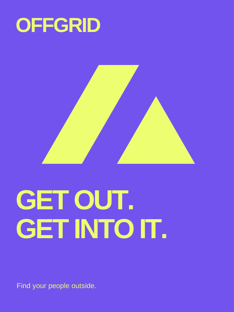
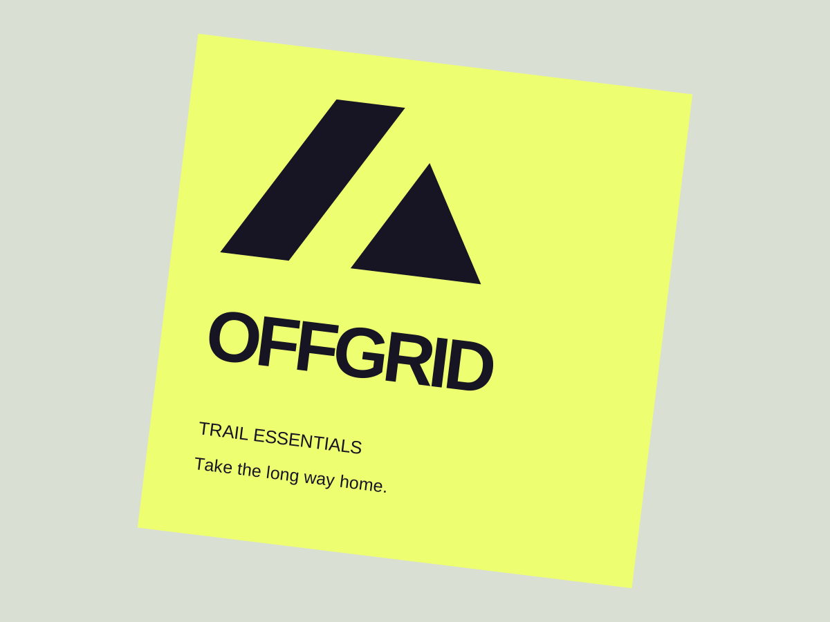
The brief called for an energetic, recognizable system. The angular mark combines a path and a peak; the type is bold enough for a poster and simple enough for a small label.
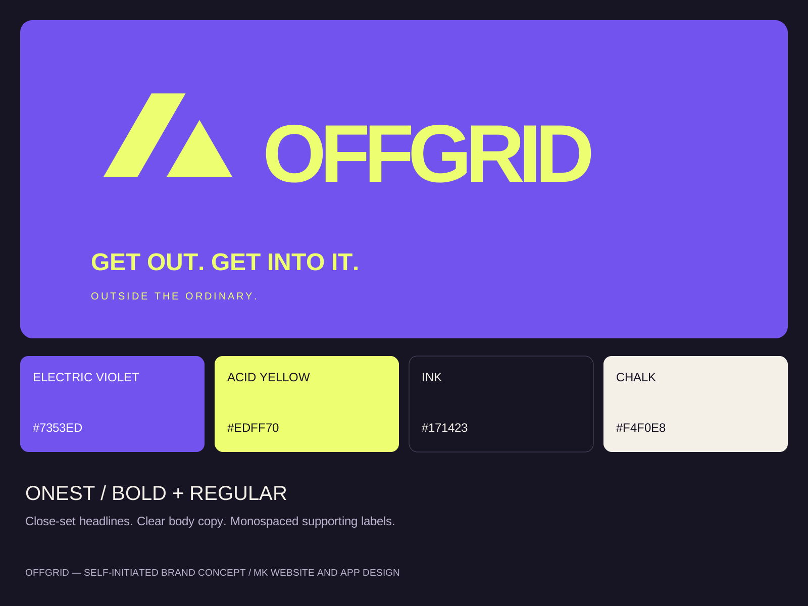
The mark, wordmark, palette, and type work as a family, and the brand board brings them into one reference. This is concept work created for the MK Sites portfolio, not a commissioned client identity.
From a poster to a label.
Concept applications of the same mark, palette, and type.